Welcome to the fifth blog post in the series on machine learning. This post is a supplement of the Udacity course Intro to Machine Learning. Be sure to check out the course if you find Regression interesting.
Discrete Data
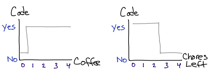
Up until now, we have been doing supervised learning with discrete labels. Discrete values are limited in size and fit the output categorically. A discrete value could simply be a “yes” or “no”, or even describe a deck of cards with numerical values from 1 to 52.
If we revisit last weeks post, we can clearly see that our outputs (labels) are discrete values: either I will indulge in my favorite hobby, or I will not.
So now what happens if I want to change the y axis to “level of motivation,” and use the range of 0% to 100% (and even consider floating point values)? This is where regression and continuous data comes into play.
Continuous Data & Regression
Regression should remind you of your high school math class (sorry if this brings up bad memories), but we are basically just determining the equation for a graph. After that, we will take this equation, and apply it to additional test values.
My eye doctor recently told me that eye sight tends to degrade until the age of 24. After that it will taper off a bit until about age 40. For this reason, we will consider a graph containing the first 20 years of age, and then predict the percentage of the population who is 24 with glasses. Keep in mind these numbers are just rough estimates.
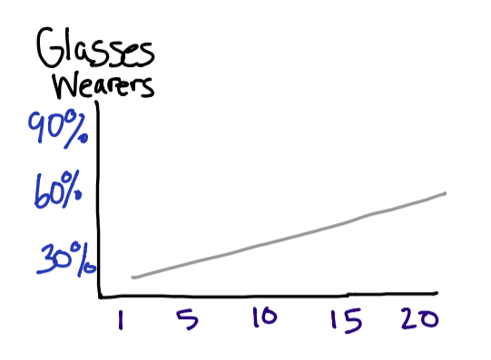
First determine the slope by taking the rise over run. Since (I hope) there are not any babies born wearing glasses, we will start the graph at 0. This means we can simply take 50% and divide it by 20.
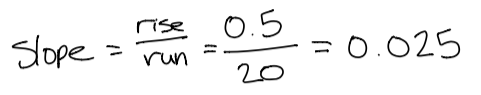 This will help us find our regression equation. A simple regression equation is
 y = m*x + b. Pluging in values, we get y = 0.025*x + 0. There are some more complicated linear models if you are curious.
So, how many 24 year olds wear glasses? If we follow the trends in our graph and assume that there is a linear growth in people aquiring glasses, then we get:
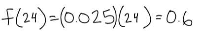
60% of people is not a terrible approximation – especially when we assume linear growth.
Stock Evaluation
As you might already know, one of my favorite hobbies is coding. Another (more expensive) activity that I enjoy is stock investing. Here we will be doing an evaluation of Apple and Google using linear regression. My hope is that in future blog posts, I will reuse this example for other algorithms – allowing us to discover which one is best for predicting stock trends.
The following two graphs were created with Plotly. I found this library to be useful for graphing larger datasets so that we can get an idea for what data we are working with.
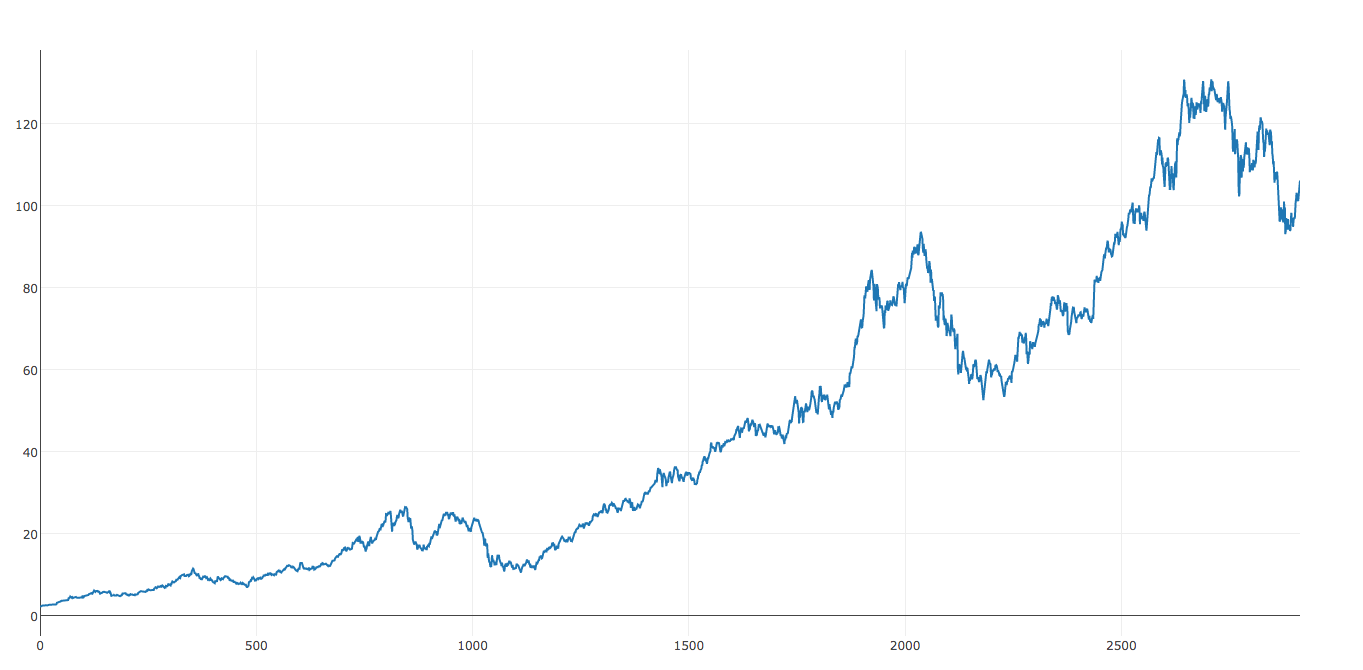
By looking at this dataset, we can already see that we might have some issues with linear regression. The dataset really seems to flatten out from around 900 to 2000. This will probably result in a lower slope value. Therefore, we can expect to receive more conservative predictions.
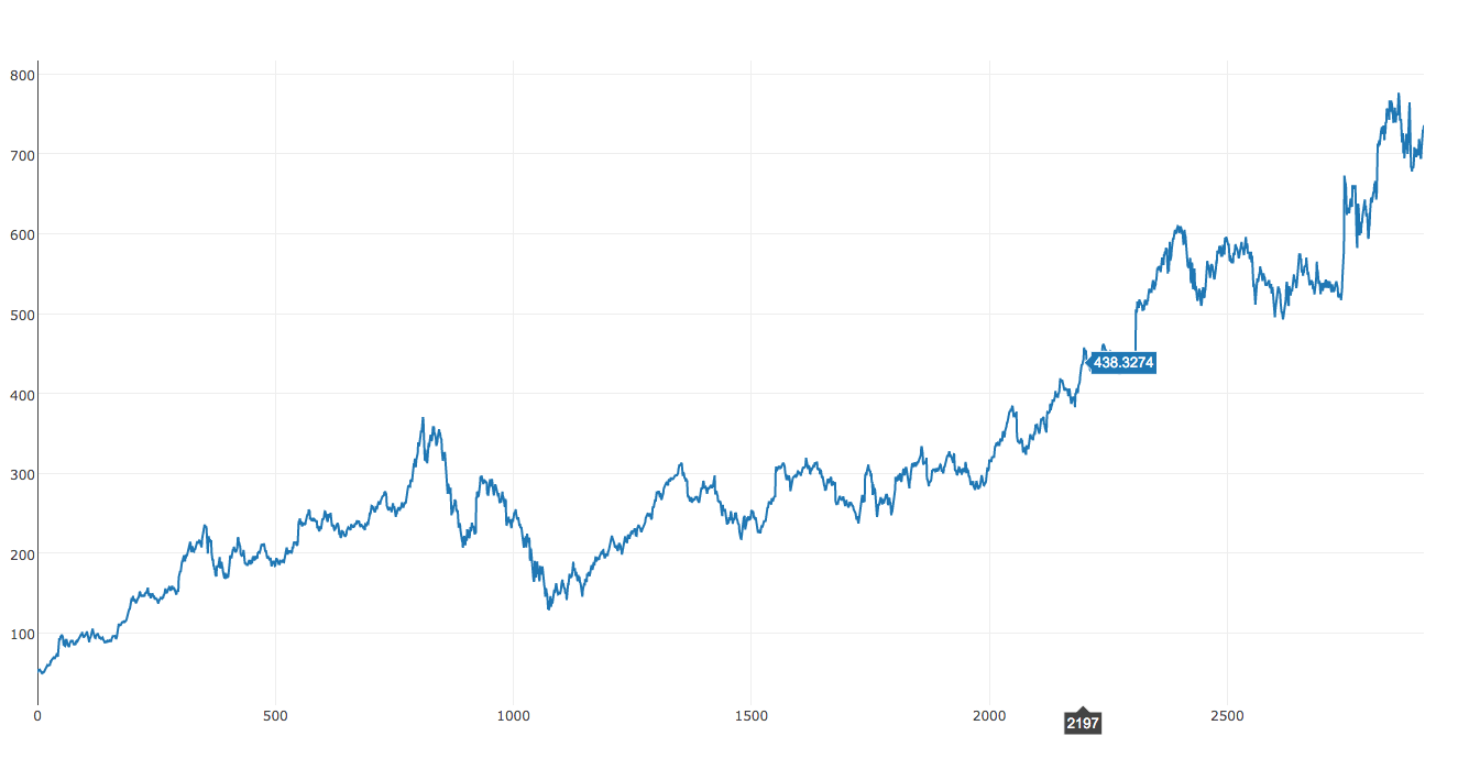
Apple
On the other hand, Apple seems to be a little different. If you grab a pencil, and line it up on the graph (in attempt to finding a best fitting line), you will notice that Apple has a higher slope than Google. Let’s hope our linear regression agrees as well!
When evaluating the effectiveness of an algorithm, it is important to save some of the data for finding the percentage of error. For this example, I decided to reserve off one years worth of data. This comes to be about 12% of the total dataset.
This code example was a bit more involved since I am not using hardcoded numbers. Woo! Now we can get our hands dirty with a little scripting.
from sklearn import linear_model
import numpy as np
import csv
with open('apple.csv') as csvfile:
    x = []
    y = []
    count = 0;
    reader = csv.DictReader(csvfile)
    stop = 2914-365
    for row in reader:
        x.append([ count ])
        y.append(float(row['Adj Close']))
        count += 1
        if count >= stop:
            break
clf = linear_model.Ridge (alpha = .8)
clf.fit(np.array(x), y)
print "Slope: " + str(clf.coef_)
prediction = clf.predict(count+365)
print "Prediction Today: "+ str(prediction)
Google
Slope: [ 0.14184961]
Prediction Today: [ 512.7632998]
Google gives us an error of 30.7% since the stock is currently at $738. Wow, this was very far off! I wonder if this has anything to do with restructuring the parent company to ABC. After all, it does make the earnings report a little more attractive.
Apple
Slope: [ 0.03457702]
Prediction Today: [ 92.04404184]
Likewise, if the Apple stock is currently at $105, this gives us an error of 12.3%. Not to shabby, but we might be able to do a better prediction in the future.
It also may be worth exploring some of the previously covered algorithms for this dataset. Finding a suitable algorithm could give some good insight on which companies to choose. ???
Conclusion
Remember to reserve some of the data for testing when evaluating the effectiveness of an algorithm. This allows you to know what level of error to expect for inputs with unknown outputs. It also gives a good benchmark for comparing different algorithms
Even though machine learning can sometimes be a complicated topic, the regression technique shows how simple some of the arithmetic can be. All we are doing is finding a function for a given dataset and using this function to predict future values. This algorithm is great for linear datasets, and is pretty fast too.
Behind the Scenes
Since this is a larger blog post with nontrivial components (such as the stock data), I want to share some of the experiences I encountered. My hope is that this will help others in their machine learning adventures.
Working with Real Data
This was my first time working with actual data. Doing stock market evaluations has always been an interest of mine, so I was very excited to have my financial and computer science knowledge cross paths. Yahoo provides downloadable datasets in CSV format.
Looking back, I wish I would have downloaded a dataset with a larger timespan. The one that I was working with dates back to about 2008, so it was right after the crash – I didn’t do this intentionally, it was just Yahoo’s default. My guess is that the slopes would be considerably lower had we included the data before the 2008 crash.
Veering Off the Udacity Track
If you have been keeping up with the Udacity course as well, you might have noticed that I skipped two chapters. I was about a quarter of the way into the “Datasets and Questions” chapter when I realized that there was not much to really write about. Much of the chapter was about Enron and described the structure of the emails. Had I done a blog post about Enron, it would probably consist of doing an experiment with the emails. This would have been much more time consuming than the stock example.
A Pleasant Surprise About Blogging
At first I was very nervous about publishing this work on the internet – especially when it involves my employer’s reputation. I feared that I would not deliver proper quality, or even worse… spread misinformation. Since I am following the Udacity course, I was able to put most of those concerns to rest.
I found that blogging is also a great medium for proving what you have learned. In fact, I find that I learn more (and remember what I have learned), by regurgitating the definitions and developing my own examples. It also keeps me accountable for doing some real world examples every now and then to show that there are some pretty awesome applications. I recommend blogging for anyone that wants to learn something new!