Welcome to the sixth blog in a series on machine learning. Once again, this material is a supplement to the introductory course in machine learning on Udacity. We will be reviewing the basics of clustering as well as making a real world application to the stock market.
Unsupervised Learning
So far, all of our machine learning algorithms have been under the supervised learning umbrella. As you may recall, supervised learning is when data is classified with features (inputs) and labels (outputs). This allowed us to feed the system an input, and be able to yield an output based on the training data.
Supervised learning is great for classifying data that has labels; however, what happens when we want to classify data without labels? This is where unsupervised classification comes into play.
Finding labels
Imagine you are given a database of pictures. In this database, you are told that each picture could be one of two possible things: a cup of coffee, or a car. Furthermore, we do not know which are cups of coffee, and which are cars (unless we manually look at each picture). Using clustering, we can determine the appropriate categories without sifting through thousands of pictures ourselves!
Though I will not be writing a code sample for separating the photos, the approach is fairly straightforward. Using sklearn, we can convert photos into vectors. This conversion uses a process called feature extraction. Feature extraction can be used for text, photos, audio, or any other medium that you may want to interact with.
Once in proper vector form, we simply and then feed this information into the clustering algorithm. This will result in the photos being associated with one of the two categories. If we were to graph the results, we may get something similar to this:
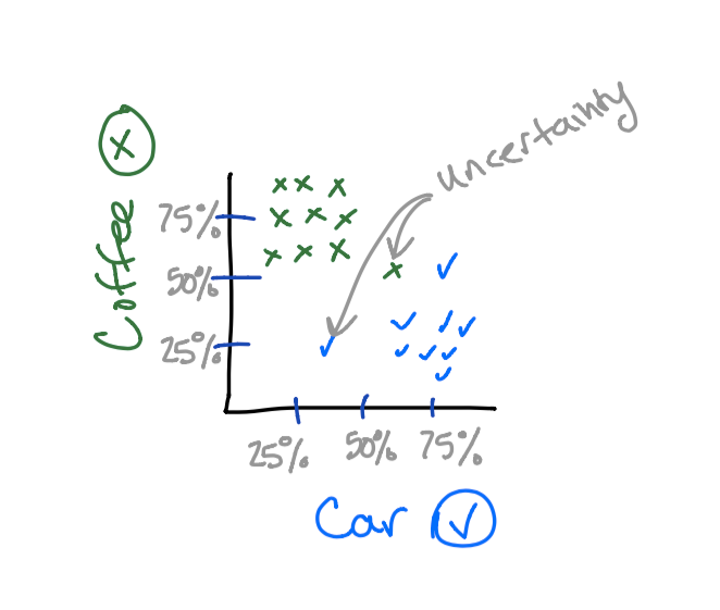
Now that we can visualize this information, we can answer the question “how do we classify something to be coffee,” or “how do we classify something to be a car?”
Centroids are used to aid in the classification of a vector. Centroids tend to gravitate towards larger clusters such that most vectors surrounding are equidistant to the centroid. Since a picture is worth a thousand words, it is probably easiest to show you. ?
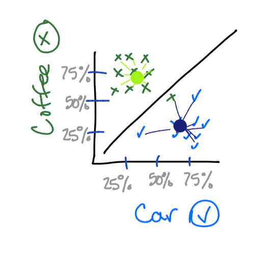
So now when additional vectors are provided to us, we can simply see which centroid it is closer to. Notice how one of the cups of coffee was classified as a car. Maybe the cup was in car shape! ?
K-Means
So now that we know how centroids work, how do we get them in the proper locations? The K-Means algorithm is one strategy to assess this situation.
When we begin, we need to decide what the optimal amount of centroids is. In the previous example, 2 centroids is optimal since a picture can be either a car, or cup of coffee.
Once the appropriate amount of centroids is decided, the next step is to randomly place these centroids on the graph. After the placement, the rest of the algorithm repeats the following two steps until the desired results are found:
- Assign
- Optimize
In the assignment phase, each vector is associated with its nearest centroid. This can be calculated by using the distance formula. After that the centroids are moved such that the vectors are, on average, equidistant in length to the centroid.
Since the initial placement of the centroids is random, it is a good idea to run the algorithm a couple times so that you can find the best location for the centroids. By default, Sklearn will evaluate the centroids 300 times and then determine the best result.
Diversifying A Portfolio
As the phrase “Don’t put all of your eggs in one basket” preaches, it’s usually a good decision to avoid allocating all of your resources to a single entity. The same is true with stock market investing.
Defining Diversification
Normally when we think of stock diversifying, we will separate our money based on the industry. Though this is a well proven way to mitigate your losses, I want to do a little experimenting and see if we can find some other ways of diversification using clustering. We will cluster stocks together and rank them based on volatility. This will allow us to choose both stable and volatile stocks.
What makes for a volatile stock? In my own opinion, I believe that stocks with dividends tend to be less volatile, while stocks without dividends tend to be more volatile. Good portfolios will contain a wide range of volatility as well as a diversification in industry.
The companies that I am using for this evaluation are:
amd, americanexpress, anchorbank, apple, boeing, cisco, coke, colgate, disney, eep, facebook, fizz, ge, google, intel,
mcdonalds, nike, nvidia, pepsi, tesla, toshiba, twitter
Linear Regression
First, I pulled historic stock data from Yahoo Finance and saved these into csv files. After that, I performed a linear regression between the unix timestamp and stock price. If you are unfamiliar with linear regression, this would be a perfect time to take a quick break and check it out.
import datetime, glob, csv, os
from sklearn import linear_model
import numpy as np
results = []
for file in glob.glob("*.csv"):
    with open(file) as csvfile:
        x = []
        y = []
        currentPrice = -1;
        reader = csv.DictReader(csvfile)
        for row in reader:
            x.append([datetime.datetime.strptime(row['Date'], "%Y-%m-%d").strftime('%s')])
            y.append(float(row['Adj Close']))
            currentPrice = row['Close']
        clf = linear_model.Ridge(alpha = .8)
        clf.fit(np.array(x), y)
        print(file + ":" + str(clf.coef_[0]) + ":" + str(currentPrice))
Then I simply piped the results into another file:
python regression.py > results.txt
results.txt
----------------------------------------------
amd.csv:-3.52448233135e-09:36.00
americanexpress.csv:1.02326173198e-07:54.937714
anchorbank.csv:1.13148308334e-07:10.05
apple.csv:2.43438526777e-07:14.875
boeing.csv:1.98942502493e-07:66.00
cisco.csv:1.58101826784e-08:38.25
coke.csv:1.61257388308e-07:37.875
colgate.csv:1.07019784975e-07:64.550003
disney.csv:3.36727382953e-08:37.25027
eep.csv:4.9755572793e-08:41.25
facebook.csv:7.78265993003e-07:38.23
fizz.csv:5.23874652166e-08:9.00
ge.csv:-2.26763954609e-09:47.9375
google.csv:1.3751234001e-06:102.370178
intel.csv:2.2619554099e-08:30.0625
mcdonalds.csv:2.12308730931e-07:34.00
nike.csv:3.13910352318e-08:11.50016
nvidia.csv:2.71614131246e-08:19.68744
pepsi.csv:1.27768710918e-07:49.5625
tesla.csv:1.60479612773e-06:23.83
toshiba.csv:-7.05133220946e-08:33.950001
twitter.csv:-4.38435837997e-07:44.900002
I am not too worried about using a unix timestamp as our y axis for regression since we are just looking for the slope. Even if we used days, months, or even years, the graphs below would look exactly the same despite the y axis metric being different.
Clustering
Finally, we can perform a clustering algorithm to evaluate where the groups of vectors reside. I also entered in some mock-prices to see which clusters we would be assigned to.
from sklearn.cluster import KMeans
import numpy as np
f = open('results.txt', 'r')
NUM_OF_CENTROIDS = 3
x = []
y = []
for line in f:
    comps = line.split(":")
    x.append([float(comps[2])])
    y.append(float(comps[1]))
clf = KMeans(n_clusters=NUM_OF_CENTROIDS)
clf.fit(np.array(x), y)
results = clf.predict([[ 10 ], [ 20 ], [ 50 ], [ 100 ]])
print results
print clf.cluster_centers_
### => [0, 0, 2, 1]
### => [[ 40.323499  ], [ 77.64006033], [ 14.82376667]]
Since these results don’t tell us a whole lot, it would also be useful to see these points graphed. The second output you see here is the locations of the 3 plotted centroids.
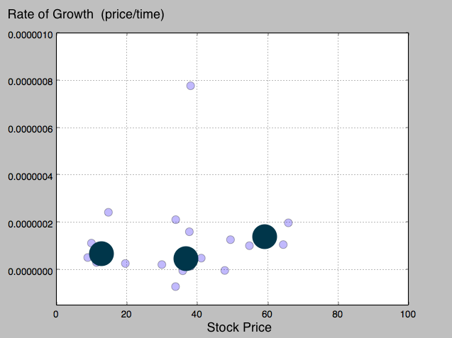
If we had more data to work with, I think we would converge on some pretty interesting results. Above you can see that the last centroid is slightly higher than the other two. Though I could be very incorrect with this assumption, I will try and depict what I am seeing here.
Since the last centroid was a little higher than the other, this means that we can associate higher priced stocks with a higher rate of growth.
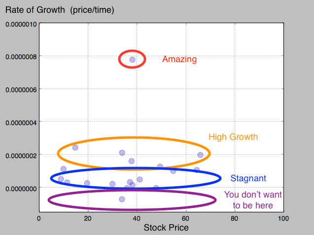
Additionally, there are also some stagnant stocks. These are associated with the 14 and 40 cluster. These stocks most likely have higher dividends compared to the 60 cluster. Stocks that pay out dividends tend to be lower in growth since the dividends paid out to the shareholders reduces the amount of money that can be reinvested into the company.
Had the clustering occurred more on the y axis, we would be able to see a definitive separation in volatility compared to price. I guess you can’t always get what you want in the stock market ?.
So How Do We Apply This!?
This is a good question, and I think a lot of the results are left up to interpretation. I would personally say that it is good to invest in companies from each of the clusters we found. This allows your portfolio to be filled with different priced stocks as well as different levels of volatility. Ultimately though, a company should be invested in if you believe it is a good company, not entirely on what the numbers say.
Disclaimer: Keep in mind that it is not a good idea to blindly invest into one of these vectors. Always do your homework before investing!